LL wip

Show us your drawings and animation made with the TVPaint technology here !
User avatar
Klaus Hoefs
Posts: 570
Joined: 03 May 2008, 22:24
Location: Hamburg
Contact:

LL wip

Post by Klaus Hoefs »

some stills from L(eopold) L(ehmann) - wip
they are from the Intro, locations are the harbor and the bank office
all 14 images:
http://www.khoefs.de/images/LL_wip/index.htm

examples:
Image

Image

Image

Image
__________________
http://www.khoefs.de
User avatar
Julian wigley
Posts: 51
Joined: 06 May 2008, 11:46
Location: Australia
Contact:

Re: LL wip

Post by Julian wigley »

I was going to check out, but saw these delightful drawings. Notice a bit of PP is creeping in to LL, just saved by Image 23- a hoot, as Americans would say.
The harbour is rich.
All the best,
Jules
User avatar
Klaus Hoefs
Posts: 570
Joined: 03 May 2008, 22:24
Location: Hamburg
Contact:

Re: LL wip

Post by Klaus Hoefs »

Thanks, Julian.

- to take one's cue from PP for learning isn't too bad ;-) , I think. If you anchor in own seas.
__________________
http://www.khoefs.de
User avatar
Peter Wassink
Posts: 4299
Joined: 17 Feb 2006, 15:38
Location: Amsterdam
Contact:

Re: LL wip

Post by Peter Wassink »

small observation: both your avatars form a perfect visual reflection of your language use

btw Klaus, very nice drawings!
Peter Wassink - 2D animator
• PC: Win11/64 Pro - AMD Ryzen 9 5900X 12-Core - 64Gb RAM
• laptop: Win10/64 Pro - i7-4600@2.1 GHz - 16Gb RAM
User avatar
Paul Fierlinger
Posts: 8100
Joined: 03 May 2008, 12:05
Location: Pennsylvania USA
Contact:

Re: LL wip

Post by Paul Fierlinger »

Truly nice and I don't see that much of PP in there at all -- if anything, I think they are routed in traditional German graphics art, which fits the period and settings they depict. I like the idea of combining scantily rendered characters for animation and more detailed characters (presumably) for not so animated portions. If I am presuming too much than I would have some doubts about how those richer drawings will come out in motion.

I also like the economical use of color within these drawings. I've been experimenting with using less color myself for characters that are drawn with just a few thin lines. When they are filled out with buckets of paint they loose their built-in charm of dexterity and simplicity. If they are painted with textured brush strokes, they boil too much.

I think we have both been trying to work this problem out in the same direction without knowing it. This just proves that it's something that comes out naturally through the combination of media and animation. Such coalition of "styles" will inadvertently evolve when two artists use the same tools for the same medium and purpose.

Are your steeples in the BKG slanted? I go through these problems myself a lot and was delighted some time ago when I discovered that this tendency hadn't missed any of the great masters of the past either, including Leonardo Da Vinci. To protect myself from this I make a lot of use of the grid and "flip" button.

I can't wait to see these scenes in motion -- and just once more; I assure you that I see very little resemblance of my style in yours; we just happen to be using similar drawing tools.
Paul
http://www.slocumfilm.com
Desktop PC Win10-Pro -64 bit OS; 32.0 GB RAM
Processor: i7-2600 CPU@3.40GHz
AMD FirePro V7900; Intuos4 Wacom tablet
User avatar
Klaus Hoefs
Posts: 570
Joined: 03 May 2008, 22:24
Location: Hamburg
Contact:

Re: LL wip

Post by Klaus Hoefs »

Peter and Paul thank you both very much.
Paul Fierlinger wrote:If I am presuming too much than I would have some doubts about how those richer drawings will come out in motion.
One result of my former project "travel" (which I shut down) was that it doesn't work (or is too much labor) to animate highly detailed (in my case crosshatched) characters.
So I was and I am still looking for a smart solution. So far I reduced the characters with motion to a more outline-style with little parts e.g. of grey crosshatching inside. This parts
should connect and integrate them to the all crosshatched and detailed background. Otherwise, with no connection, they would fly away.
Paul Fierlinger wrote:When they are filled out with buckets of paint they loose their built-in charm of dexterity and simplicity. If they are painted with textured brush strokes, they boil too much.
I agree. It is very important to keep the lines alive and have them breathing. Also the danger with crosshatching is to drive the whole thing to death - imo this can be seen at many dry-point-etchings. So I do the less controlled style with chaotic individual free strokes.
Paul Fierlinger wrote: Are your steeples in the BKG slanted?
Sorry, I don't know what you mean with "slanted steeples", Can you please explain it a little more to me ?

...and Jules, what did you mean with PP ??? - did you mean PF ? what I (and others) were guessing ?
__________________
http://www.khoefs.de
User avatar
Peter Wassink
Posts: 4299
Joined: 17 Feb 2006, 15:38
Location: Amsterdam
Contact:

Re: LL wip

Post by Peter Wassink »

Klaus Hoefs wrote: ...and Jules, what did you mean with PP ??? - did you mean PF ? what I (and others) were guessing ?
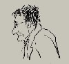
Pablo Picasso i'd say... but hey... i don't have a foggy avatar :wink:
Peter Wassink - 2D animator
• PC: Win11/64 Pro - AMD Ryzen 9 5900X 12-Core - 64Gb RAM
• laptop: Win10/64 Pro - i7-4600@2.1 GHz - 16Gb RAM
User avatar
Klaus Hoefs
Posts: 570
Joined: 03 May 2008, 22:24
Location: Hamburg
Contact:

Re: LL wip

Post by Klaus Hoefs »

Klaus Hoefs wrote:Pablo Picasso i'd say
uugh! --- did Picasso ever made some homo-erotic paintings/drawings ??
Can't remember one.
__________________
http://www.khoefs.de
User avatar
Paul Fierlinger
Posts: 8100
Joined: 03 May 2008, 12:05
Location: Pennsylvania USA
Contact:

Re: LL wip

Post by Paul Fierlinger »

Sorry, I don't know what you mean with "slanted steeples", Can you please explain it a little more to me ?
Leaning church towers, but at a new glance I see it was a stupid question. My problem is that I have just started using "no line" trifocals when I am working on my computers and have not yet adjusted to the annoying phenomenon that things can appear to be slanted when I am not looking at them directly, but from the side. I had your drawing on one computer, way to my side while I was writing on a monitor directly in front of me.

I have to turn my head more often but then I vomit all over my keyboards.
Paul
http://www.slocumfilm.com
Desktop PC Win10-Pro -64 bit OS; 32.0 GB RAM
Processor: i7-2600 CPU@3.40GHz
AMD FirePro V7900; Intuos4 Wacom tablet
User avatar
Paul Fierlinger
Posts: 8100
Joined: 03 May 2008, 12:05
Location: Pennsylvania USA
Contact:

Re: LL wip

Post by Paul Fierlinger »

Klaus Hoefs wrote:
Klaus Hoefs wrote:Pablo Picasso i'd say
uugh! --- did Picasso ever made some homo-erotic paintings/drawings ??
Can't remember one.
Actually Picasso didn't like men and drew them poorly, or tried avoiding drawing men altogether.
Paul
http://www.slocumfilm.com
Desktop PC Win10-Pro -64 bit OS; 32.0 GB RAM
Processor: i7-2600 CPU@3.40GHz
AMD FirePro V7900; Intuos4 Wacom tablet
User avatar
slowtiger
Posts: 2899
Joined: 08 May 2008, 21:10
Location: berlin, germany
Contact:

Re: LL wip

Post by slowtiger »

Paul Fierlinger wrote:
I have to turn my head more often but then I vomit all over my keyboards.
I have the very same problem with my new "work" glasses. My normal ones start getting into focus at about 20 cm, but when I draw on the Cintiq this is too exhausting, so I asked my opticion for a near-sighted version. But these have a very strong "slant" effect.
TVP 10.0.18 and 11.0 MacPro Quadcore 3GHz 16GB OS 10.6.8 Quicktime 7.6.6
TVP 11.0 and 11.7 MacPro 12core 3GHz 32GB OS 10.11 Quicktime 10.7.3
TVP 11.7 Mac Mini M2pro 32GB OS 13.5
User avatar
Peter Wassink
Posts: 4299
Joined: 17 Feb 2006, 15:38
Location: Amsterdam
Contact:

Re: LL wip

Post by Peter Wassink »

Klaus Hoefs wrote:
Klaus Hoefs wrote:Pablo Picasso i'd say
uugh! --- did Picasso ever made some homo-erotic paintings/drawings ??
Can't remember one.
http://en.wikipedia.org/wiki/Image:Read ... _small.jpg

Although i don't see this as homo-erotic, but neither do i see Klaus drawing as such.
Peter Wassink - 2D animator
• PC: Win11/64 Pro - AMD Ryzen 9 5900X 12-Core - 64Gb RAM
• laptop: Win10/64 Pro - i7-4600@2.1 GHz - 16Gb RAM
User avatar
Klaus Hoefs
Posts: 570
Joined: 03 May 2008, 22:24
Location: Hamburg
Contact:

Re: LL wip

Post by Klaus Hoefs »

maybe this ones move more inline:
Image
__________________
http://www.khoefs.de
User avatar
Paul Fierlinger
Posts: 8100
Joined: 03 May 2008, 12:05
Location: Pennsylvania USA
Contact:

Re: LL wip

Post by Paul Fierlinger »

Tantalus wrote:
Klaus Hoefs wrote:
Klaus Hoefs wrote:Pablo Picasso i'd say
uugh! --- did Picasso ever made some homo-erotic paintings/drawings ??
Can't remember one.
http://en.wikipedia.org/wiki/Image:Read ... _small.jpg

Although i don't see this as homo-erotic, but neither do i see Klaus drawing as such.
That must have been painted around the time PP decided he will turn to women for his painting subjects (and otherwise).
Paul
http://www.slocumfilm.com
Desktop PC Win10-Pro -64 bit OS; 32.0 GB RAM
Processor: i7-2600 CPU@3.40GHz
AMD FirePro V7900; Intuos4 Wacom tablet
User avatar
Julian wigley
Posts: 51
Joined: 06 May 2008, 11:46
Location: Australia
Contact:

Re: LL wip

Post by Julian wigley »

Paul Fierlinger wrote:
Klaus Hoefs wrote:
Klaus Hoefs wrote:Pablo Picasso i'd say
uugh! --- did Picasso ever made some homo-erotic paintings/drawings ??
Can't remember one.
Actually Picasso didn't like men and drew them poorly, or tried avoiding drawing men altogether.
Unless depicting man-bulls.
And an apology- I keep putting a P in front of the F- to make "PF"....put it down to inattention to detail, or just old age- not sure which!
Post Reply