Here are some short scenes and backgrounds of the second episode of the animation I am working on. In this episode I have been focused on the acting and personality of the characters and also on trying to find an interesting line and a way to clean up the drawings.
David, those backgrounds have terrific atmosphere but I wonder if you aren't setting yourself up for something insurmountable to complete. Are you up to carrying through characters to match the dynamics of those stunning camera angles and swooping perspectives? It's not that it is hard to visualize what could be happening throughout those scenes but the slickness of the stylization you are using calls for the same advanced quality of acting.
I hope you find your own way to create a happy match. It looks like the bird standing on top of something I can't recall without going back to the picture is a practical solution if you will find a way to color the characters (unlike the complex modeling of the mechanic in the lower picture) so that they won't look like cutouts on a photograph yet will be manageable to carry and survive the process of many inbetweens.
On the other hand, with a good sound track, recorded with the same quality and color as those backgrounds, I wonder if you might not be able to find a way to tell a story using a minimum of animation. That would require lots of quick cuts and an anime style of camera moves. You might have reached a crossroads at which you have to choose a stylistic animation direction to pursue.
As far as the animation tests go, I'd suggest that you experiment with something more dynamic with a character that moves all over the place, much like your backgrounds would require. Either that, or just outrageous cutouts that would mock the backgrounds; I can imagine that might work well too. Those long depths of focus into the distance already dictate how characters would have to at one moment dash about and next come to an absolute stop to say something in the camera's face with lots and lots of spot on facial expressions.
But with cutouts you could go silly with making characters jump from ECUs to far distances with absolutely no inbetweens.
I think you're onto something interesting and I'm curious to see where you will take it next to create a successful marriage of actors and stage props that you can handle all by yourself, which I think is your intention.
Paul http://www.slocumfilm.com
Desktop PC Win10-Pro -64 bit OS; 32.0 GB RAM
Processor: i7-2600 CPU@3.40GHz
AMD FirePro V7900; Intuos4 Wacom tablet
The lighting in you backgrounds is amazing. The colours are great. But they could be improved (couldn't everything be improved?) just a bit ...
Just compare the 3rd and 4th BG. The last one is completely OK with its cutout-like quality for a mixer. But in #3 I feel a bit uncomfortable with the combination of hand-painted stuff (helmet and tires) and scanned or photographed elements (the clippings on the wall). For my personal taste this would work better if you could "blend" the edges a bit more. Maybe you try a version in which you soften the tire edges - not with a blur filter, but with some dry brush strokes, perhaps.
BG #1 suffers from parallels, IMO. The upper part consists of rectangles exactly arranged along the screen borders - this makes it appear mechanical and boring. At least try to break the straight lines a bit - that little red roof could be torn a bit, or disattached on one side.
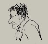
Your characters seem to be a bit over-agitated. This might be necessary for them, I don't know, I'm not so familiar with those hip hop gangs. In any case, you spend too much unnecessary work into them - you need to work a bit more economically. It is not necessary to re-draw the whole character for each mouth position, except in very few very agitated shots, like shouting.
One possible way to reduce your work load would be like this:
- Try to find good key poses just for the body and head first. Time the scene so you stay in one pose for a certain time (fitting the dialogue), then switch to the next pose in just a few frames.
- In the next run, you'll add the arm movement which, as far as I can see, accompanies the dialogue with those "gang sign" alphabet. If this is a kind of sign language, then you should treat it as just another lip sync level - stock drawings for the signs, put at the right places via the Xsheet.
- Last step: add the mouth shapes according to the dialogue (again, Xsheet is your friend).
In this setup you might have one body&head layer, on arm layer, and one mouth layer, separately on top of each other. I know that I advocate an industrial way of production here, but this is a proven way to get lots of footage without overworking. Talking heads are a routine job, so you shouldn't tire yourself with it. Save your power for the really moving scenes.
TVP 10.0.18 and 11.0 MacPro Quadcore 3GHz 16GB OS 10.6.8 Quicktime 7.6.6
TVP 11.0 and 11.7 MacPro 12core 3GHz 32GB OS 10.11 Quicktime 10.7.3
TVP 11.7 Mac Mini M2pro 32GB OS 13.5